The following is a list of things I've learned over the years when developing user interfaces. It works especially well when paired with a component library like React.
Use utility classes
In CSS, a utility class is a class that is designed to perform a specific utility function, such as styling a single property or applying a common pattern. Utility classes are typically small, reusable, and targeted to accomplish a specific task.
For example:
.text-sm {
  font-size: 12px;
}
.mb-1 {
  margin-bottom: 10px;
}
.text-color-blue100 {
  color: blue;
}
.bg-color-gray100 {
  background-color: gray;
}
By using utility classes, you can quickly and consistently apply styles throughout your application without repeating CSS declarations or writing custom styles for each individual element. It's also easier to identify unused CSS and debug issues since you can quickly see what styles are being applied to an element. For example:
<div class="bg-color-gray100">
  <h2 class="text-sm bg-1">hello world</h2>
  <div class="text-color-blue100">look at me!</div>
</div>
The great thing about utility classes is that you can easily create your own that suit your specific needs. However if you'd prefer to use something already built here are some great options:
- Tailwind CSS: Tailwind CSS is one of the most widely used utility CSS frameworks. It provides a comprehensive set of utility classes for styling elements, spacing, typography, and more.
- Bootstrap: While primarily known as a full-fledged CSS framework, Bootstrap also includes a set of utility classes for common styling tasks.
Limit your styling options
By limiting the choices, you can enforce a consistent look and feel across your application. When developers have a predefined set of options for styling elements, they are more likely to adhere to consistent design patterns, leading to a more cohesive user experience.
In practice this means you should ensure you have well defined options when it comes to the following:
- Colors
- Font sizes
- Margins
- Paddings
If you're using utility css classes here's an example of how you could create a set of classes for adjusting margins:
/* Using the golden ratio (1.618) */
$base-spacing: 16px; /* Base spacing unit */

/* Margins */
.mb-1 {
  margin-bottom: calc(1.618 * $base-spacing);
}
.mb-2 {
  margin-bottom: calc(1.618^2 * $base-spacing);
}
.mb-3 {
  margin-bottom: calc(1.618^3 * $base-spacing);
}
Avoid external margins on your components
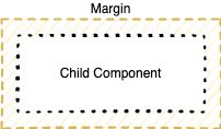
Avoiding external margins on components is generally recommended for several reasons related to maintainability, consistency, and predictability of your layout. External margins are any margins applied to the outside of your component:
Components with external margins applied may be less reusable in different contexts or layouts. Lets say you've created a Button component and you want to place two buttons on the sides of a container:
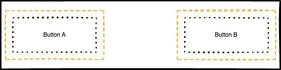
Since there's a margin present on the outside of each button, you'd have to counteract this by applying a negative margin to each button within your parent component. However, negative margins may lead to elements overlapping or being unpredictably positioned, making it advisable to avoid them whenever feasible.